

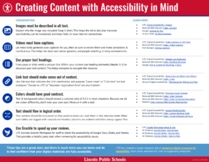
 We are pleased to offer a more approachable 1-page summary of the most essential considerations for content creators. There is a lot of great background information and explanations found in this page. Please come back when you need clarification or to reference further information!
 Creating content that is fully accessible often presents technical challenges. To consult with Computing Services analysts about issues you encounter, please create help desk tickets for the tool you are using (Google Docs, WordPress, etc.) and they will be happy to help!

Effective writing tips
If you want to learn more about effective writing techniques, here are some great resources to explore:
- 'Writing Clearly and Simply'
- 'Writing for Web Accessibility'
- BOOK: 'Writing for Busy Readers' by T. Rogers, J. Lasky-Fink
- BOOK: 'Smart Brevity' by J. VandeHei, M. Allen, R. Schwartz
Teaching students with color vision deficiency
Headings in Google Docs
Within a Google Doc the Headings tool offers a “Title” formatting option. Unfortunately this does nothing for us from an accessibility standpoint. Our recommendation is to avoid using the "Title" formatting option your Docs. Instead, use Heading 1 for the text you think of as the “title” shown at the top of your Google Doc.
Titles in Google Slides
Title text can only be defined by the slide deck’s theme. If you add a text box to a slide it cannot be identified as a title. Most default theme layouts include a place for title text, but not all. Avoid using slide layouts that do not have a title text defined. (“Blank”, “Caption”, etc.)

Accessible Google Docs
Most of the content you create in LPS will probably be in Google Docs, Slides, & Sheets. This resource will help you learn how to make your Google Workspace documents more accessible for everyone, including people with disabilities.
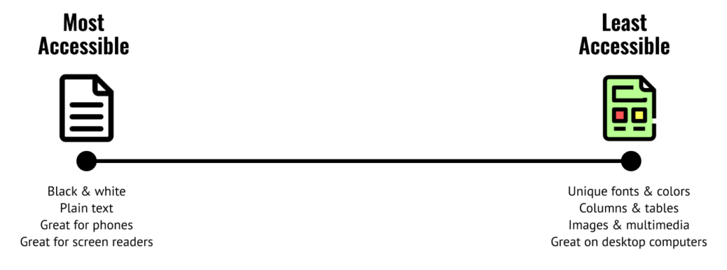
Ensuring visual contrast
Generally speaking, you should always make color choices that create as much contrast as possible between text and background. Other things to consider:
- Sticking to true primary
 shades will help readers with color vision deficiencies (CVD).
 - Avoid pastels
 or deeply saturated colors
  . These colors tend to blend together for people with CVD.
 - Don’t put text or data on top of a background image.
How do I know if I have chosen safe colors?
Contrast is a measure of the perceived difference in brightness between two colors. This difference is expressed as a ratio ranging from 1:1 (white on white) to 21:1 (black on white). ADA conformance requires a minimum contrast ratio of 4.5:1 for text color vs background color in most situations.
Informative Images
Photos or illustrations that represent concepts, deliver information, or exist in direct support of the topic should have alt text conveying the information that was intended to be evident in the image. This may include “unspoken” information you intended the reader to understand, such as emotion or analogy.

If context matters because the page is about a person in the picture, or the school, you might use a fully descriptive text alternative.
- Longer Alt-text: Image of a classroom setting at Lincoln Southwest High School. In the foreground a student wearing a blue hoodie is focused on a laptop. The school Principal is seated beside them, engaged in friendly conversation. Several other students are visible in the background, sitting at desks with laptops. The brightly lit classroom has a neutral color scheme with beige walls and light-colored furniture.
If context does not matter because the page is about applying for a job with LPS, or students using computers, you might use a shorter text alternative.
- Shorter Alt-text: An adult and a student converse in a classroom with laptops.
Charts, Graphs, and Diagrams
Alt tags for charts, graphs and diagrams
Complex images that contain substantial information require a two-part text alternative.
- The first part is the short description to identify the image. This is included in the image Alt Text field.
- The second part is the long description, a textual representation of the essential information conveyed by the image. This text is shared adjacent to the graphic in the document/page, or can be in a separate location that is connected via a link.
Consider the example shown here:
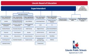
Alt-text: Organizational chart showing the divisions, departments and roles of Lincoln Public Schools.
Long description appearing in the document/page or linked elsewhere:
This organizational chart for Lincoln Public Schools was approved on June 13, 2023. It begins with the LPS Board of Education, whom the Superintendent reports to. Many divisions, departments and roles are listed as reporting to the Superintendent, including:
- Associate Superintendent for Human Resources
- Benefits, Classified Professional Development, Employee Relations, Personnel, Recruiting, Risk Management and Substitute Services
- Associate Superintendent for Teaching & Learning
- Continuous Improvement and Professional learning, Curriculum, Instruction & Assessment, Elementary Education, Focus Programs, Library Services, Secondary Education
- Associate Superintendent for Educational Services
- Early Childhood, Federal Programs & Grants, Health Services, Security, Special Education, Student Services
- Associate Superintendent for Business Affairs
- Accounting & Payroll, Audit, Budget & Finance, Nutrition Services, Operations & Custodial, Purchasing, Distribution, Print Center, Mail, Transportation
- Associate Superintendent for Civic Engagement
- Athletics & Student Activities, CLC, Governmental Relations, SJDLC Principal, TeamMates, Wellness
- Executive Director of Communications
- Chief Technology Officer
- Executive Director of Equity, Diversity & Inclusion
- The ESU 18 Administrator also reports to the Board of Education.
For more information and ideas on how to handle alt text for complex images, try these resources:
- Alt Text for Complex Images (W3c)
- Long Description Example (W3C)
- Writing Alt Text for Data Visualization (Amy Cesal)
Images of Text
Whenever possible, avoid using an image of text instead of actual text. However, when images of text are used the alt text field should contain the same words as are shown in the image. Common examples include company logos.

Alt-text: Lincoln Public Schools Board of Education, 5905 O Street, Lincoln, NE 68510. A statement reads: “The Lincoln Public School District does not discriminate on the basis of race, color, national origin, religion, sex, marital status, sexual orientation, disability, age, pregnancy, childbirth or related medical condition, genetic information, citizenship status or economic status in its programs, activities and employment.”
IMPORTANT! Do NOT include images in your email signature.
There is not a way to include alt text with images used in Gmail signatures. For this (and other reasons,) images should not be used in your email signature.
Decorative Images
When the only purpose of an image is to add a visual decoration to the page for sighted readers, leave the alt tag field empty (blank) so that screen reader software treats it as non-important.

Alt-text: -blank-
Generate alt text faster
There are tools that use AI to scan an image and generate potential alt text. Arizona State University offers a good example. These sites are very helpful for speeding up the process, but please be aware of a few things:
- Never upload images that contain protected data.
- The alt text they provide should be considered a helpful jump start, but you are responsible for editing as appropriate.
- Remember that you will have better context for any emotion or details that may need to be included to provide context to the reader. (Emotion, setting, etc.)
More to consider: Should AI write my alt text?

Manually review captions before publishing
Recent technology advances have made auto-captioning tools VERY good. However, they still make mistakes that dramatically effect meaning. A human needs to review any computer generated captions for accuracy before publishing.
Captimization Help
There is art and science to providing appropriate text alternatives to videos. These resources offer helpful lenses into the topic:

Purchasing content?
If you are in a position where you are evaluating content (apps, materials) created by a vendor, there are more complex considerations prior to a purchase. The National Center for Accessible Educational Materials suggests these guidelines when making sure that all people can use the materials.
![]()
Google Workspaces
Google provides accessibility conformance reports for their products, based upon the VPAT framework.
You can assume that Google tools are compliant, but your content may or may not be. Refer to these tips for making your Google Workspace content more readable for everyone.

MS Office
MS Office tools have an Accessibility Checker built-in. This resource explains how to check Word, PowerPoint and Excel for accessibility issues.
![]()
WordPress
WordPress is committed to ensuring that the code used to create their web tools is accessible. However, the content we create in WordPress may not be. Start with a manual review of your content. Beyond that, you may find the WAVE accessibility checker is also helpful at identifying barriers.
![]()
PDFs (Acrobat)
PDFs are held to (basically) the same accessibility standards as any other content, and they should be reviewed for the same criteria.
One key difference to consider is text selectability. This is assumed on web pages, but might not be the case in older PDFs that are simply an image of text.
You can use a checker found in Acrobat and Acrobat Pro to begin evaluation for common issues, but like web pages a manual check will be required.
If your PDF is not compliant, you may need to recreate it from source materials, or manually create a new original.
![]()
Canva
Canva has a built-in accessibility checker that can evaluate content you may have created there. Launch that checker within Canva by opening your file and visiting:
- File Menu > Accessibility > Check design accessibility
Learn more about accessible design within Cava.

You must be logged in to post a comment.